SAFETY FIRST
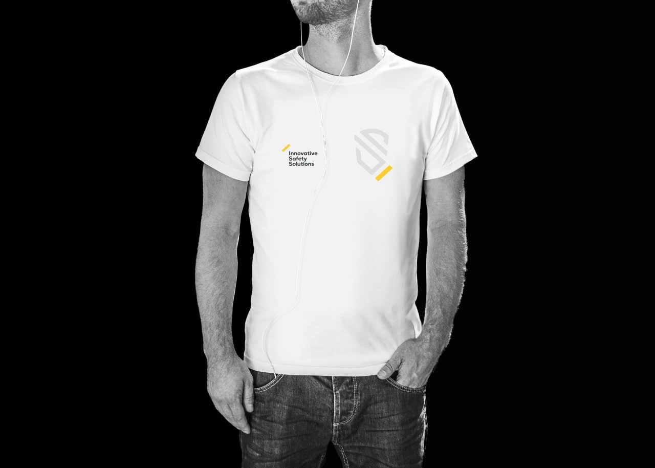
For the Safety First Brand we performed rebranding and prepared a comprehensive visual identification of the company.
- visual identity
- rebranding
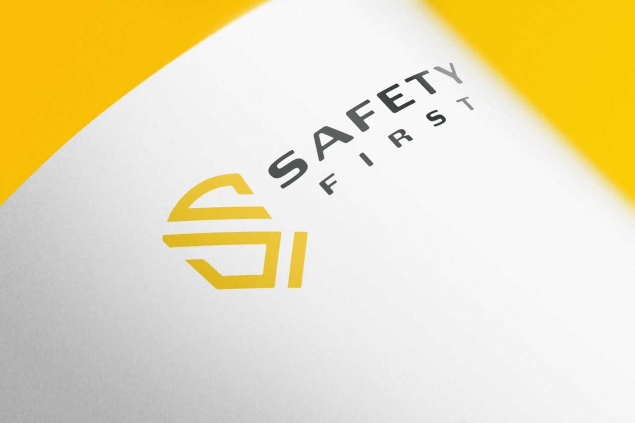
Logo
We have prepared a logo consisting of a shield which symbolizes safety, in addition to which the letter "S" is inscribed. The bar emphasizing the dial is to symbolize the number "1".

Identyfikacja wizualna
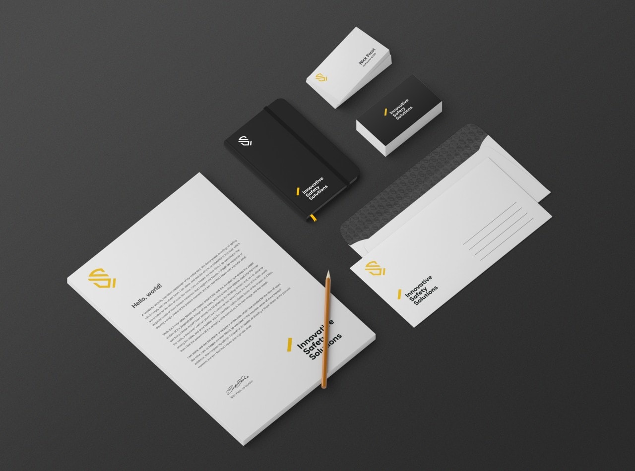
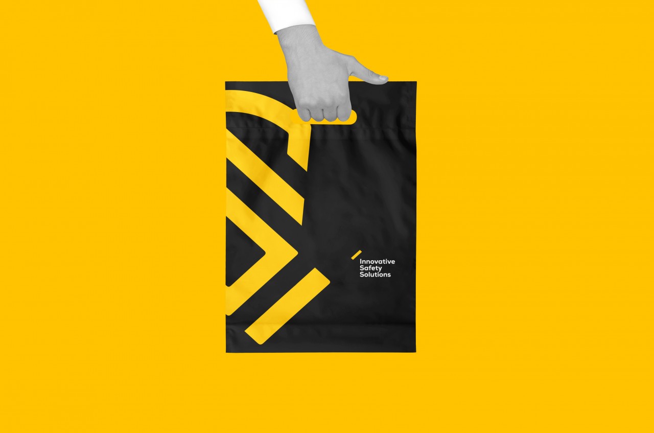
We have prepared a comprehensive visual identification of the company.
Nośniki reklamy
For the cohesion of the image we have prepared projects in various fields of exploitation.
